The quick service restaurant (QSR) industry has evolved significantly in the past few years – especially since the pandemic ushered in the need for new methods of service delivery, like contactless payment and curbside pickup. Drive-thru design has also become increasingly innovative in response to changing consumer demands.
In short, having a well-designed drive-thru improves your customer experience and helps streamline your restaurant operations. To help you find the right drive-thru design for your own venue, this article will cover:
- 11 different drive-thru design ideas that you can consider for your QSR venue
- 4 key considerations for creating a great drive-thru experience
11 Creative Drive-Thru Design Ideas
From special lanes for third-party delivery drivers and even motorcyclists, to conveyor belt food dropoff, drive-thru restaurant design and drive-thru ordering systems have become more creative than ever.
This is great news since these innovations make the drive-thru experience more convenient for customers. According to QSR magazine, nearly 80% of drive-thru visitors rank convenience as the most important part of the experience. So, let’s explore 11 ideas to inspire your next drive-thru build or renovation.

1. Go Big or Go Home
If you thought having two lanes in your drive-thru was ambitious, think again! Taco Bell went big in summer of 2022 with its new four-lane drive-thru design, called Taco Bell Defy.
Interestingly, three of the four lanes at the new location (in Brooklyn Park, Minnesota) are intended for mobile order pickup, which speaks to the popularity of online ordering. The new Taco Bell drive-thrus also offer contactless food delivery via a lift-powered system.
2. Leverage the Double Drive-Thru
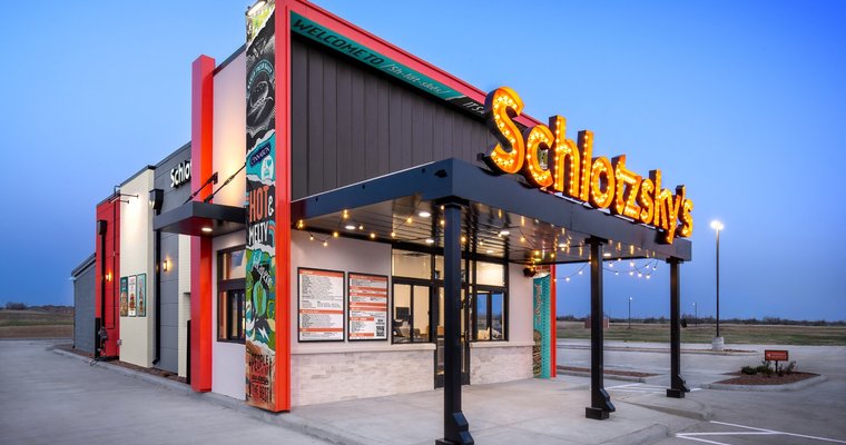
Not in need of a large-scale drive-thru design like Taco Bell’s four-lane setup? No problem! You can streamline your drive-thru operations with just two lanes, like Schlotzsky’s did at its Oklahoma City location.
Instead of using a drive-thru layout design with two lanes side-by-side, Schlotzsky’s built one drive-thru lane on each side of the building. One of the lanes takes traditional drive-thru orders, while the other handles third-party order pickup. This approach is especially useful if you do a lot of business through food delivery services.
3. Designate a Mobile Order Pickup Lane
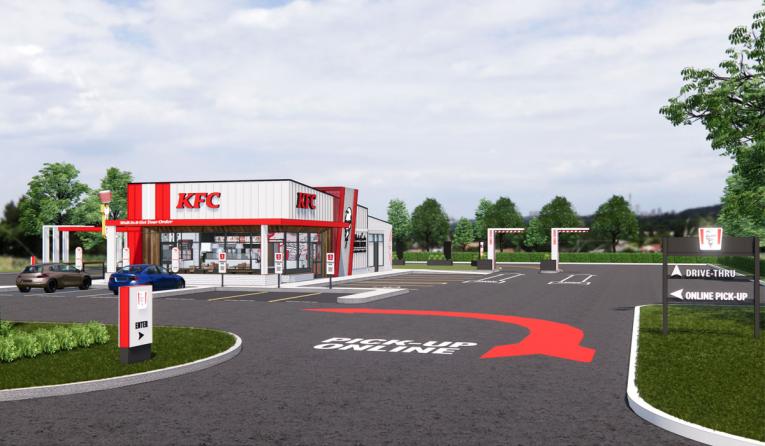
Another type of double drive-thru, a mobile order pickup lane enables you to serve more customers faster. KFC implemented this drive-thru layout design at its Next-Gen restaurants in 2021, officially starting the roll-out in Berea, Kentucky.
As part of the redesign process, KFC knew it was important to consider how the back-of-house could support the new drive-thrus. This strategic approach has worked well for the QSR chain, with sales increasing 12% in Q4 of 2021.
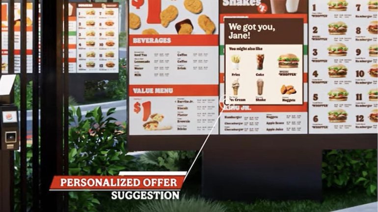
4. Incorporate Menu Personalization
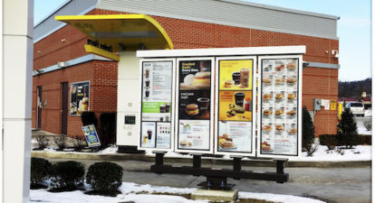
Smart drive-thru menu design is key to a great drive-thru experience. McDonald’s believes in this principle so much that after using technology company Dynamic Yield’s personalization solution in 2018, the QSR giant bought the tech company.
Today, 12,000 McDonald’s drive-thrus in the U.S. use personalization technology to make specific menu item recommendations to customers.
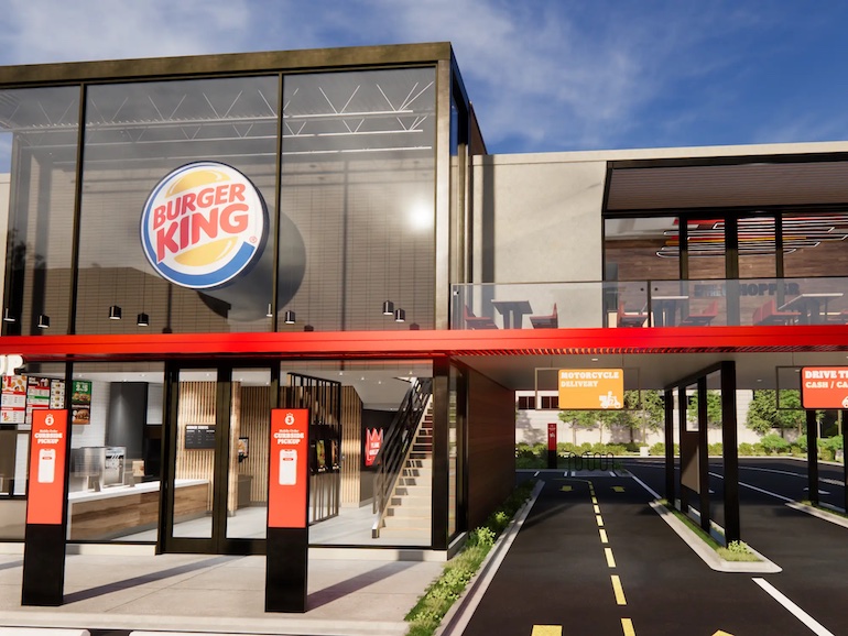
5. Create a Motorcycle Lane
A motorcycle lane may not be a necessity in a northern climate. But, it’s a perfect drive-thru design feature for warmer locales like Miami, Latin America, and the Caribbean – which is exactly where Burger King piloted the concept in 2021.
Burger King created the motorcycle lanes as part of a larger drive-thru restaurant design project the chain undertook. The revamp also included extra drive-thru lanes, conveyor belts that deliver food to cars, and a “drive-in area” with solar-powered canopies where customers can place orders and get their food brought to their car.
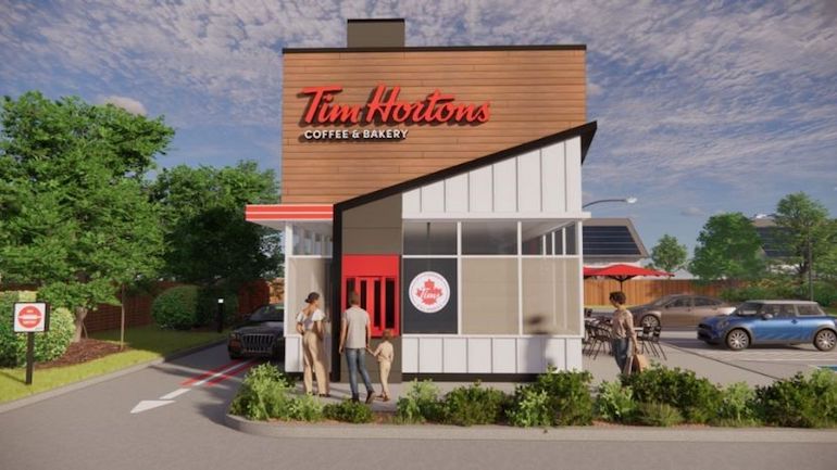
6. Open a Drive-Thru Only Venue
Take drive-thru design to the next level by making it the focal point of your next venue, like Tim Horton’s did by opening its first drive-thru-only unit in the U.S. in 2022.
The drive-thru-only trend has taken the QSR industry by storm since the pandemic. According to Restaurant Dive, “Sweetgreen, White Castle, Jimmy John’s, and Taco Bell are also adding digital or drive-thru-only units.”
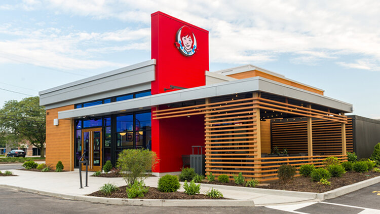
7. Use Innovative Building Materials
Traditional construction meets innovative design at the Wendy’s chain’s new Smart 2.0 restaurants. Some of the brand’s drive-thru-only venues are constructed from shipping containers, which allows the company to scale up production of these units quickly.
“Our designs are adaptable and designed to work well across any market and footprint. Other benefits include both reduced costs and increased efficiencies,” Wendy’s says.
8. Incorporate Your POS System
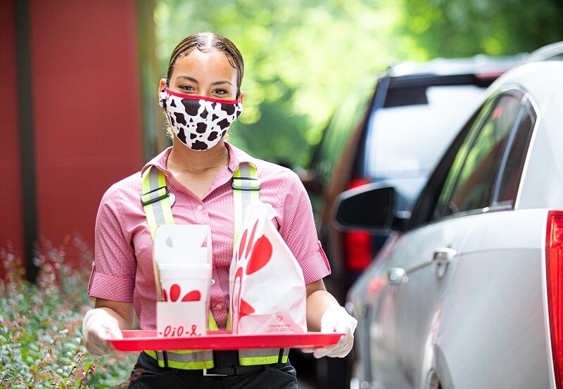
Drive-thru ideas can focus on numerous areas of your business – the physical space and its aesthetic, drive-thru menu design, or the customer experience from a service standpoint. In this example, Chick-fil-A focused on the latter.
America’s largest chicken chain added mobile tablets to its drive-thru experience when the pandemic hit, so staff could walk the drive-thru line and take orders to speed up the process for guests. With some locations serving more than 100 drive-thru customers per hour, this was a wise move for the brand.
9. Set Up Your Kitchen for Success
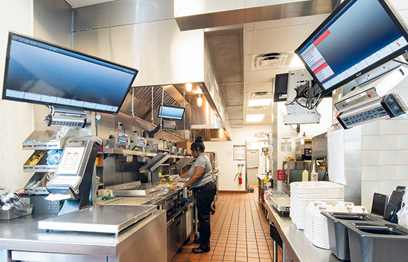
Smart drive-thru design goes beyond considering the part of the drive-thru that’s visible to guests. Good back-of-house design is also critical to running an effective operation.
Krystal, a QSR restaurant chain based in Georgia, widened its drive-thru window and expo station, as well as upgraded to a higher-capacity cook line in 2018. This evolution helped the 85-year-old brand become more efficient and decrease drive-thru wait times.
10. Shrink Your Dining Room
By now you might be wondering, with all the spotlight being placed on drive-thrus, doesn’t something else have to take a back seat? In fact, it does – and the dining room is the place where many QSRs are scaling back.
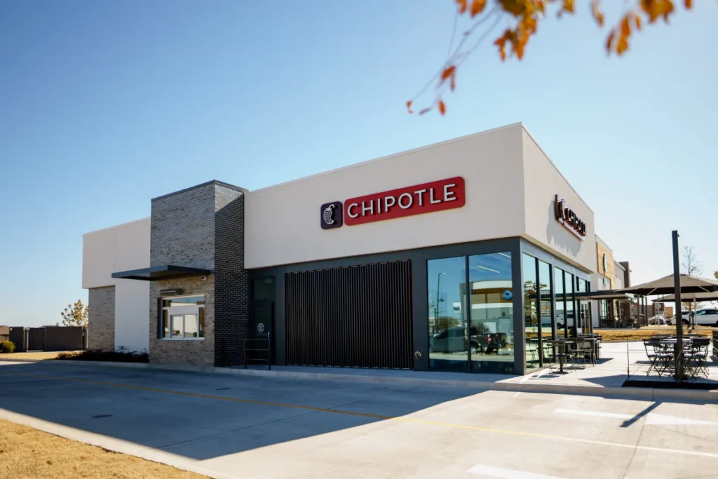
For example, “Chipotle is considering adding smaller restaurants with a ‘Chipotlane’ – potentially with a tiny dining room or no dining room at all – in between larger stores to create a convenient access point to customers,” Chipotle CFO Jack Hartung told Restaurant Dive.
Many of the other drive-thru designs on this list also include a smaller dining room footprint, like Taco Bell and Burger King, the latter of which will have a 60% smaller footprint.
11. Pair Drive-Thru Design with a Rebrand
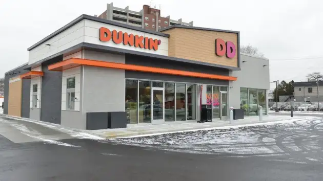
Dunkin’ Donuts is truly a pioneering brand. The company was America’s first national QSR chain to open a mobile order pickup drive-thru, back in 2018. Also notable is that Dunkin’ paired this new drive-thru launch with a larger rebrand.
If you’re considering a new drive-thru design, why not spruce up all of your restaurant branding like Dunkin’ did? The company removed the word “Donuts” from its signage to expand the scope of its offerings in customers’ minds, and rolled out new staff uniforms.
4 Key Considerations for Great Drive-Thru Design
Regardless of the style of drive-thru design you choose, there are a few universal factors you should keep in mind to optimize your drive-thru.
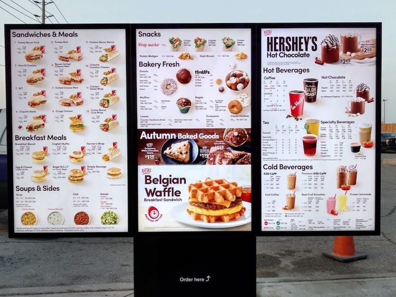
1. Make Your Menu Easy to Read
Nobody likes having to squint to read text, especially when they’re hungry! Make sure your drive-thru menu uses a large font with letters that are easy to read – so, skip the calligraphy. Incorporate visuals and white space into your menu so it’s not too text-heavy. This will also help with readability, and in turn, keep your drive-thru line moving quickly.
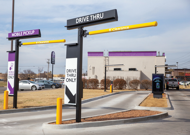
2. Create Clear Signage
If your drive-thru has multiple lanes, eliminate confusion by using signage to clearly indicate which lane is for what purpose (i.e. mobile pickup or third-party delivery driver pickup). This will help speed up your operations and create a more seamless experience for customers
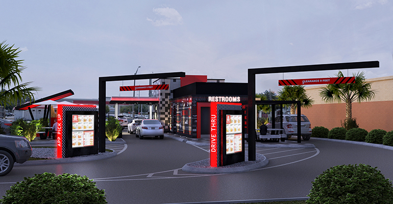
3. Provide Ample Space for Cars
A vehicle getting stuck in your drive-thru is the last thing you want to happen (we’re looking at you, Ford Raptor!). So, be sure to design the space with plenty of space that not only sedans, but also SUVs and trucks can navigate.
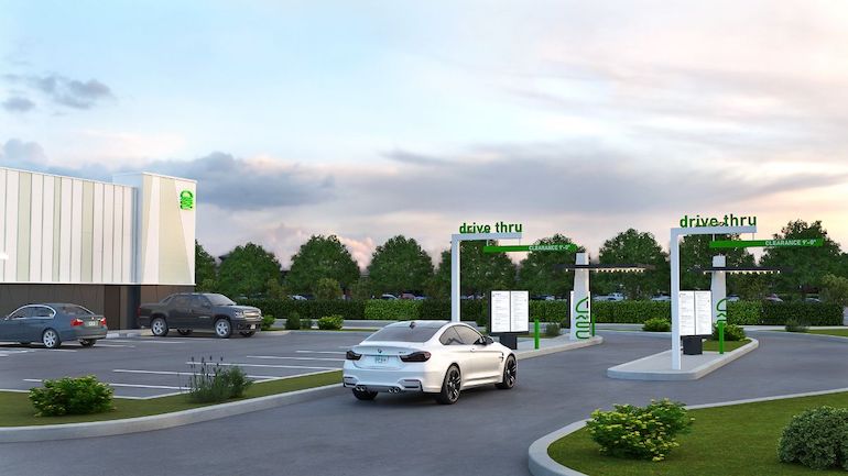
4. Landscape the Drive-Thru Area
While ideally your guests won’t be spending too much time in the drive-thru, the space should still be aesthetically pleasing. Adding even a small touch of greenery and/or shrubbery to your drive-thru can really spruce it up (pun intended).
Ready to get creative? You now have 11 drive-thru ideas you can try at your quick-service restaurant, complete with tips to make the customer experience as seamless as possible. “Would you like fries with that?” never sounded so good.
Free online ordering signs for your restaurant
Sign up for our free weekly TouchBistro Newsletter
