Online restaurant menus are more important for your business than you think.
When deciding where to eat, diners want to be able to look up your menu and determine what they can expect from your restaurant before they actually show up. In fact, a TouchBistro survey on how diners choose where to eat found that a whopping 94% of millennials check online menus before dining out.
And it’s not just customers that benefit from online restaurant menus. Your online menu is also a valuable marketing tool for your business. Not only can an online menu make your restaurant easier for diners to discover, but it can also help to build excitement around your offerings.
Unfortunately, posting your menu online isn’t as simple as throwing up a PDF copy of your print menu and hoping diners will find it. If you really want to get the most out of your restaurant’s online menu, there are some important online restaurant menu best practices to keep in mind.
In this article, we’ll help you crack the code of an awesome online menu by exploring:
- The importance of restaurant online menus
- Three online menu design tips for your restaurant
Let’s dive in.

Strategic menu design has been proven to grow profits by 15%.
Why It’s Important to Have a Menu on Your Website
By now, you probably understand the importance of having a website for your restaurant. But if your website doesn’t also include your menu, you could be missing some valuable business opportunities.
Below, we’ll outline the value of restaurant online menus and why it’s important to have one.

1. Help Diners Find and Choose Your Restaurant
Not too long ago, diners could easily stumble upon new restaurants simply by taking a walk or driving around their neighborhood. But now, the best place for diners to find your venue is on the Internet.
If your restaurant has a website, it makes it easy for diners to discover your venue with just a quick Google search. And once they find your website, your online menu can help diners compare your restaurant to the competition on everything from cuisine to price. With more information at their fingertips, diners can more easily choose which restaurant they want to dine at.
2. Set Expectations for Your Business
In addition to helping diners decide to eat at your restaurant, your online menu also lets them know what to expect when they arrive. In fact, 77% of diners visit a restaurant’s website before they dine at or order out from a venue.
Remember, not everyone likes surprises and many diners want to know whether your restaurant is worth their time (and money). For instance, if your restaurant has no vegan options available, your online menu can save some hungry vegan customers from making an unnecessary trip to your restaurant. And that saves you from their bad reviews about expectations versus reality.
3. Make Your Menu Searchable
You don’t have to be a search engine optimization (SEO) specialist to know that Google and other search engines love to look for keywords. When you include your restaurant’s menu online, search engines can crawl that text and find important keywords. Those keywords can then be used to identify your website when someone makes a relevant search.
For instance, if your online menu items include oysters, your venue is likely to pop up when a diner Googles nearby oyster bars. And with many of your prospective customers searching online before dining out, you want to make sure your restaurant’s name comes up.
4. Market Your Offerings
While it may seem like your menu will speak for itself, don’t overlook this valuable marketing opportunity. An online restaurant menu is the perfect place to play up your dishes and market your offerings. For instance, using descriptive phrases or highlighting your best sellers within your online menu can help to make your dishes stand out and build excitement among diners.
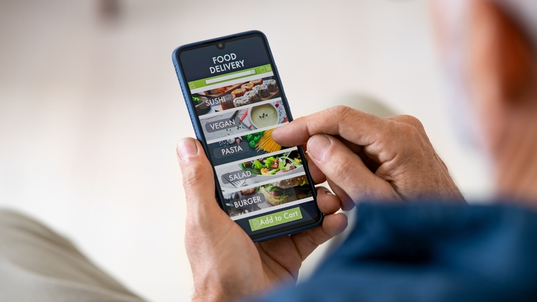
In the wake of the pandemic, takeout and delivery has become more popular than ever before. In fact, TouchBistro’s 2023 Diner Trends report found that 27% of diners are still ordering takeout and delivery weekly or more often.
If your restaurant is set up for online ordering, a great online menu can be the key to boosting online ordering sales. Beyond clear menu descriptions and great photography, you can use different menu engineering strategies such as highlighting your best-sellers or adding menu modifiers to increase the average size and spend of takeout and delivery orders.

3 Tips for Creating Awesome Online Restaurant Menus
While it’s clear that there are many benefits to online restaurant menus, this doesn’t mean that you can simply toss up a PDF of your menu and call it a day.
If you want to boost sales and actually make your restaurant discoverable online, you need to keep a few important online restaurant menu best practices in mind when setting up your online menu. Below, we cover three design tips for how to create an online menu for a restaurant.
1. Ditch the PDF
As mentioned above, search engines like Google crawl the Internet looking for keywords – keywords that help identify your restaurant’s website when someone makes a relevant search. With a text-based menu, it’s easy for Google to crawl your menu so that your specific dishes or cuisine will pop up when diners make relevant searches.
Cons of PDF menus:
- PDFs are a bit harder for Google to index unless you have properly formatted them – something that takes a bit more time and knowledge of SEO. As a result, it’s generally recommended that you include a text-based version of your menu on your website, instead of a PDF.
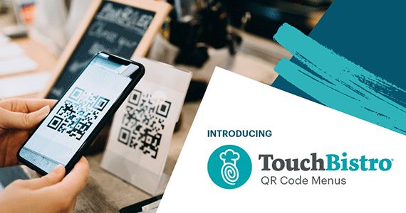
- PDF menus can also be a problem if you’re using contactless QR code menus in your restaurant. Solutions like TouchBistro’s QR Code Generator allow you to create custom QR codes that diners can scan to instantly open up your restaurant’s website on their phone.
- Once a diner is on your website, reading PDF menus can be frustrating for diners because PDFs are difficult to read on mobile and can be slow or inconvenient to load.
- If you use PDFs or images of your menu online, this means that you have to upload a new file or image every single time you make a change to your menu. Whereas a text-based version of your menu can easily be updated with just a few clicks.
With so many drawbacks to using PDFs, it’s best practice to build a proper HTML version of your menu. Though this sounds intimidating, it’s easy to do on your own with website builders like Wix or Squarespace. Alternatively, you can hire a web designer to translate your menu from print to online.

Instantly create contactless menus for your restaurant with TouchBistro’s QR Code Generator.
2. Make Your Menu Easy to Navigate
Though your online menu is a great sales and marketing tool for you, it’s also a valuable source of information for your customers. So, you want to make sure that reading your online menu is a good experience for your guests – whether they’re viewing your menu from their laptop or their phone.
Tips for making your menu easy to navigate:
- When creating a menu for a restaurant website, remember that customers don’t want to scroll through many pages to find what they’re looking for. Having too many choices can cause decision fatigue, which is when guests are faced with so many choices that they end up feeling unhappy about all of them.
- Limit the number of options that diners have to sift through with titles or icons as buttons on the top or side of your menu that can lead users to each section (e.g., lunch, dinner, bar, etc.).
- Shrink your menu by limiting the number of choices in each category, or by removing unpopular dishes and dishes that don’t travel well. With fewer choices, the selection process becomes much faster and easier for customers.
- Make sure that guests can actually read the information that’s there by using easy-to-read fonts, appropriate colors, and straightforward language in your menu.
- When you make any changes to the size or structure of your menu, test your digital menu experience on mobile phones, tablets, and laptops to make sure the process is consistent across each platform or browser (Google, Safari, Firefox, etc.) and doesn’t have any bugs.
By keeping the user experience front of mind when you design your online menu, your menu will be easier to navigate and make customers more likely to order from you.

3. Optimize for Sales with Menu Engineering
Perhaps the most important tip for how to make an online menu is optimizing for sales because you don’t want people to simply read your menu; you also want them to order.
Part of optimizing your digital menu can include using menu engineering principles and a bit of behavioral psychology to influence the dishes that diners choose.
These strategies and tactics can include:
- Include high-margin items in the “golden triangle” where a customer’s eye goes first (the center, then the top right and top left corners).
- Highlight high-margin items with different lines, colors, or formatting to catch the reader’s eye (but only one per menu category).
- Limit the selection in each category to help diners avoid the “paradox of choice.”
- Use relative pricing and make diners think they’re getting a deal by placing a cheap, yet high-profit menu item next to an expensive one.
- Promote cross-selling by recommending popular pairings – check your POS reports to find items commonly purchased together.
- Upsell by including menu modifiers like extra toppings.
- Remove dollar signs ($) to encourage customers to spend more.
- Promote special takeout-only offerings or deals.
All of these different strategies can encourage diners to choose higher-margin or low-cost dishes, ultimately boosting your bottom line.
Beyond restructuring your online menu, you can also optimize for sales by making the ordering experience seamless. With solutions like TouchBistro Online Ordering, customers can browse your menu and place their order all on the same platform so they never have to navigate away from your website or use another platform to place their order. TouchBistro Online Ordering also allows customers to place orders for right now or schedule them for later, so they can plan around their specific schedule.
This kind of direct online ordering system not only makes it easy to turn the people reading your online menu into actual customers, but it also allows restaurants to keep all the profits from those online orders.
From boosting sales to helping customers discover your venue, online menus are a powerful sales and marketing tool for restaurants. With all that in mind, it’s clear that these online restaurant menu best practices are something you can’t afford to ignore.

Strategic menu design has been proven to grow profits by 15%.
Download our free inventory template
Sign up for our free weekly TouchBistro Newsletter


